Role: UI Designer
Mentor: Deckel Mualem
UNDER ARMOUR

Mobile
Desktop


I love the challenge of bringing Brand Identity to life
#YasPlease
The Assignment
Redesign Under Armour's official website, using specific assets with the goal of highlighting their brand identity with fabrics of legendary quality.
Assets
Header

Products


Internal marketing


My goal
Is to emphasize the movement & the high-level fabric used throughout the background.
UA Legacy
About
In 2014, UA challenged itself to continue leading the industry by reducing its dependence on elastane.
Their new thread texturing techniques and polymer developments eliminated the need for elastane
Those products perform better, last even longer
& can be completely recyclable.

The Results

As soon as I saw this picture, I was completely captivated by the sight of this vibrant-looking fabric & knew that I had to showcase it in a respectable way.
Step 1
Isolating the fabric from the original picture via Photoshop.

Step 2
Choose a secondary color & change the original fabric.

Step 3
Using black as my main background color in order to:
Highlight the movement of the fabric.
To create extra contrast & a dramatic visual experience.
.png)
.png)
UI hacking
.png)
1
2
1. Fabric flow
The fabric is starting at the top left corner, moving left to right, top to bottom - draws the eye towards the flow
of content.
2. Complementary colors
Using the yellow from the asset that appears first creates great contrast with the black background & compliments the secondary colors.
.png)
3
4
3. CTA's
I wanted to display the CTA's by the correct hierarchy,
Primary action - Shop, secondary action - Add to favorite
4. Visual direction
Manipulating the picture on Photoshop, so that the character points towards the text aka guiding the user to look where it matters.
Mobile Design
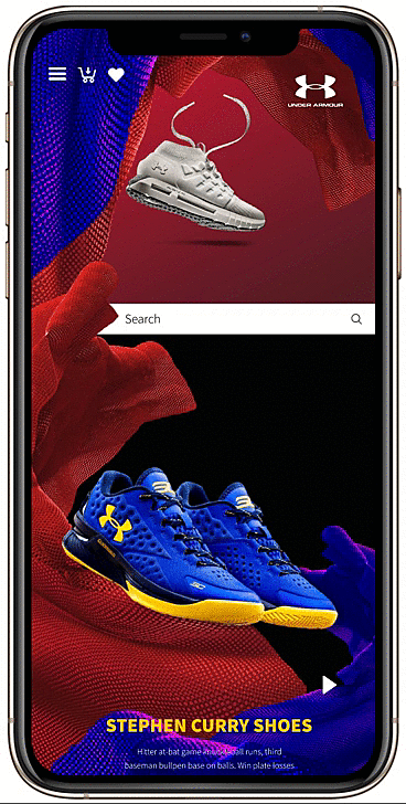


Adjusting the design to mobile view was challenging.
Knowing the screen space will minimize, I wanted to keep the flow structure I created.
I focused on delivering surprise & delights for the users, by intensifying the motion of the flow with prototyping animation.
Web Design
.png)
What Have I learned
White space
I learned that white space is my friend :) I used a lot of white space to create separation between different areas while letting the content breathe.
Photoshop skills
I learned that I'm no longer restricted by assets as is, I have the power to manipulate & change any asset, in order to fit the brand identity. I'm very proud of this project and will continue to think outside the box.
Simplicity
Throughout this project, I had to redesign the redesign a couple of times, up until I understood I had to narrow it down to 1 concept, avoiding cognitive load at all cost.

MY.MEDI
I'm sure you'll enjoy this one.
.png)

.png)