
MY.MEDi

Role: UX/UI Designer
Mentor: Shay Rozen
Mobile

I hate going to the doctor, who doesn’t?
Let's be honest, this is all of us.
The Problem
Trying to squeeze the next available slot in a busy calendar is frustrating.
Now. In addition to that,
Imagine...
.png)
You don't know the country's
language & Healthcare system.
#SweetBabyJesus
Many additional problems arise:
.png)
Great difficulty to setting up appointments for Consultant Medicine
.png)
Can't understand the procedure
.png)
Missing appointments
.png)
Lack of follow ups on prescription renewals
Interviews
At the discovery phase of my project, I conducted user interviews + questionnaires in order to get a better understanding of the problem & to be able to see the big picture.
I conducted qualitative interviews with 7 people.
I posted a questionnaire on relevant French-speaking groups on Facebook & on French speaker Health forums.
Furthermore, I printed extra forms & gave them to an experienced practitioner doctor patients.


Research Findings
60% of the interview participants said they had difficulties in the process of setting an appointment.
This result was consistent with the survey results, which showed that 83% of people answered this way.
I realized that the problem may be much more fundamental than I thought:

Main obstacles
Misunderstanding
What is written on the medical prescription
What type of medical test they need to do
How & where to set the appointment

Furthermore, most of the audience are elders. This means problems like memory loss & Tech-phobia are very common and I think they should be highly considered when creating the product.
55% said that a friend/family member set the appointment for them
27% said they missed their appointment because they forgot/ didn't write it down
50% called their medical center secretary (French speaker) to seek help & are asking to set an appointment for them
(not their job)
Special Features
After better understanding the needs & pain points of the users - I came up with a few ideas for special features, in order to help the user & create a proactive app notification system to overcome these problems.

HELP ME
Treatment escorts - the ability to add contacts as treatment escorts. The meaning of this is that escorts will get all the notifications along with the user - to ensure the user doesn't miss his appointments and everyone is up to date
Integrations between systems - phone calendar
& Waze

"ME HEBREW VERY BAD"
The user interface in users native language (Including procedure and other Health guidelines)
Search for native speaker Doctors - the ability to filter the list by Native language in order to increase better communication between doctor & patient

Design
UI adapted to seniors
Designing an app for seniors requires a different approach. Gamification and other motivators often don't motivate seniors as well. The best way to ensure that a senior consistently uses the app is to make sure it is useful and easy to use.
In order to make sure my app is suitable for elderly users, I've researched & followed these guidelines:
Keep irrelevant content off the screen.
Reduce cognitive issues in senior citizens by employing minimal design
Provide only the features that the person needs
Simple & easy navigation - keeping menus to a single function
Limited gesture control within the app
Use onboarding screens to introduce users to functions they might not be familiar with - Older users will likely pay more attention to them, reading all instructions before clicking

Keeping the "return" and "home" links readily accessible on the interface is a kind of safety net.
Using Sans serif font type for best readability & Bigger fonts and icons.
Onboarding screens
.png)
Homepage
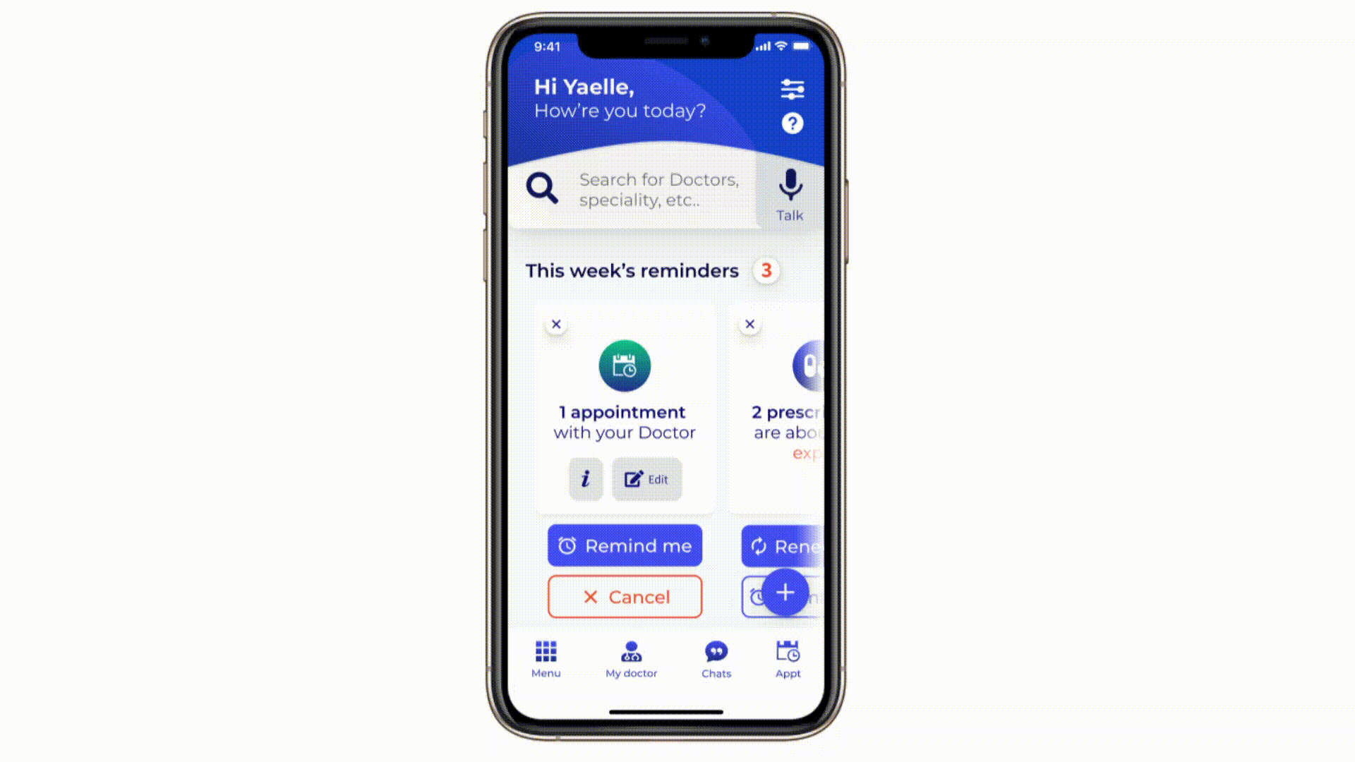
After a long design process, I created a simple & clean Homescreen that only displays the most important information.
I used simple Icons since elders are unfamiliar with technology (including design aspects)
Menu

It was very important to design a menu that was simple and easy to reach. Due to the fact that most of our users are older, all items are bigger (given the fact their sight gets weaker by age).
Setting up appointment
What Have I learned
Designing for elders
The first time that my targeted audience is mainly elders. This means I had to take their mental & physical conditions into consideration while designing this app. I learned that requires a completely different approach, for example, I made everything bigger, bigger fonts, size,
simple design, etc.
Research
I learned that talking to real people with real problems, can bring amazing insights. Feeling their pain points & using my creativity to attempt to solve & ease their pain is very satisfying.

Want to see a mega-cool project?
MEIRIM

